Project
The Housing Pipeline is an in-progress civic volunteer project of the Data Science Working Group at Code For San Francisco.
Each quarter, San Francisco’s Planning Department analyzes data tracking development in the city and loads it onto an open data portal. This project aims to make that data more accessible and to establish useful but nonpolitical insights on the impact of housing policy.
Role + Timeframe
As the design lead, I had been working iteratively with a small team of data engineers and project managers over the course of 4 months. I've conducted user interviews, compiled data research, and created wireframes and interactive prototypes.
The Current State of Accessibility
The challenges this project faces and hopes to address reside on the civic and institutional levels. Housing is a popular issue of interest amongst policymakers and residents but not much is known about the effects of implemented policy.
Currently, the open data portal serves as a neutral "source of truth" for various groups including the Board of Supervisors, policymakers, housing advocates, and other interested parties. However, the data isn't widely distributed or analyzed due to its difficult to understand format. Previously, the Planning Department released quarterly reports to the public that analyzed permit data but hasn't done so since 2014.
Furthermore, there are sometimes institutional barriers that prevented the data from being entered accurately.
Our Transparency Mission
Having a shared interest with stakeholders in creating a more inclusive San Francisco through enabling accessible housing, our project aims to use data science to understand the facts and to predict the potential impact of housing policy.
How Might We Visualize Housing Data?
To address major concerns, we wanted to create a web-based resource with data visualizations and analysis of the pipeline. This would be a resource that is regularly updated and accessible to both the Planning Department and to the public. We wanted to integrate interactive features and filtering options to better understand current housing production trends and project the impact of housing policy.
Our main goals for the project include:
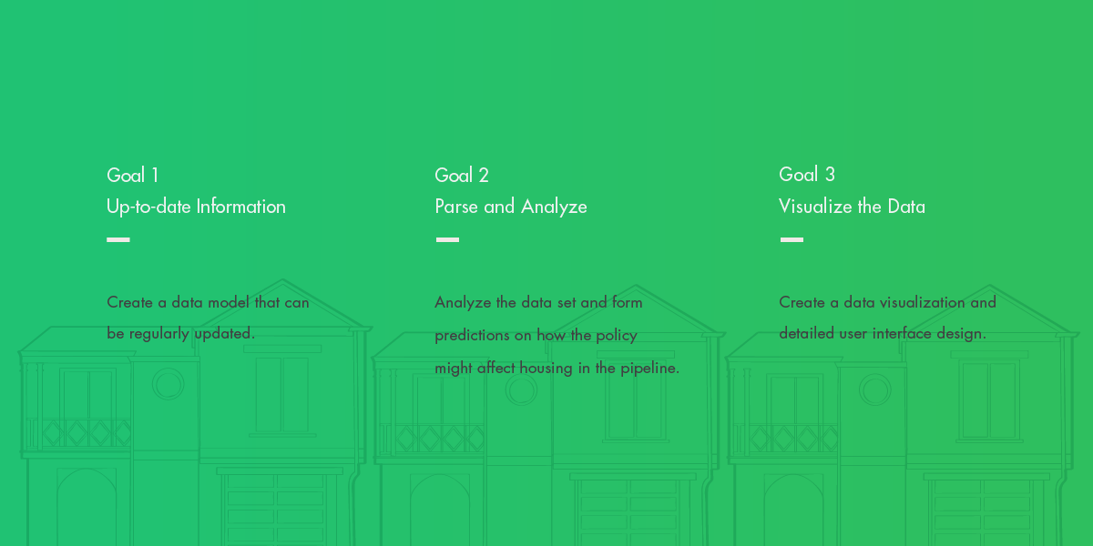
1. Updated Information
Create a data model that can be regularly updated
2. Parse and Analyze
Analyze the data set and form predictions on how the policy might affect housing in the pipeline
3. Visualize the Data
Create a data visualization and detailed user interface design
Establishing Motivations
Stakeholders + SF Planning Department Interview
We spoke with several members of San Francisco’s Planning Department and the Board of Supervisors to better understand its needs and goals for understanding housing data.
We discovered that the Board of Supervisors and Planning Department was extremely interested in knowing how newly implemented policies might be expected to impact the existing housing market. They were also motivated to view the housing permit data on a neighborhood level and to make pointed interpretations on the availability of affordable units.
Additionally, we learned that the process to apply for building permits was a time-consuming process for developers. Frustrations also occur due to little incentive within the Planning Department to have permit data consistently and accurately inputted into the data portal.
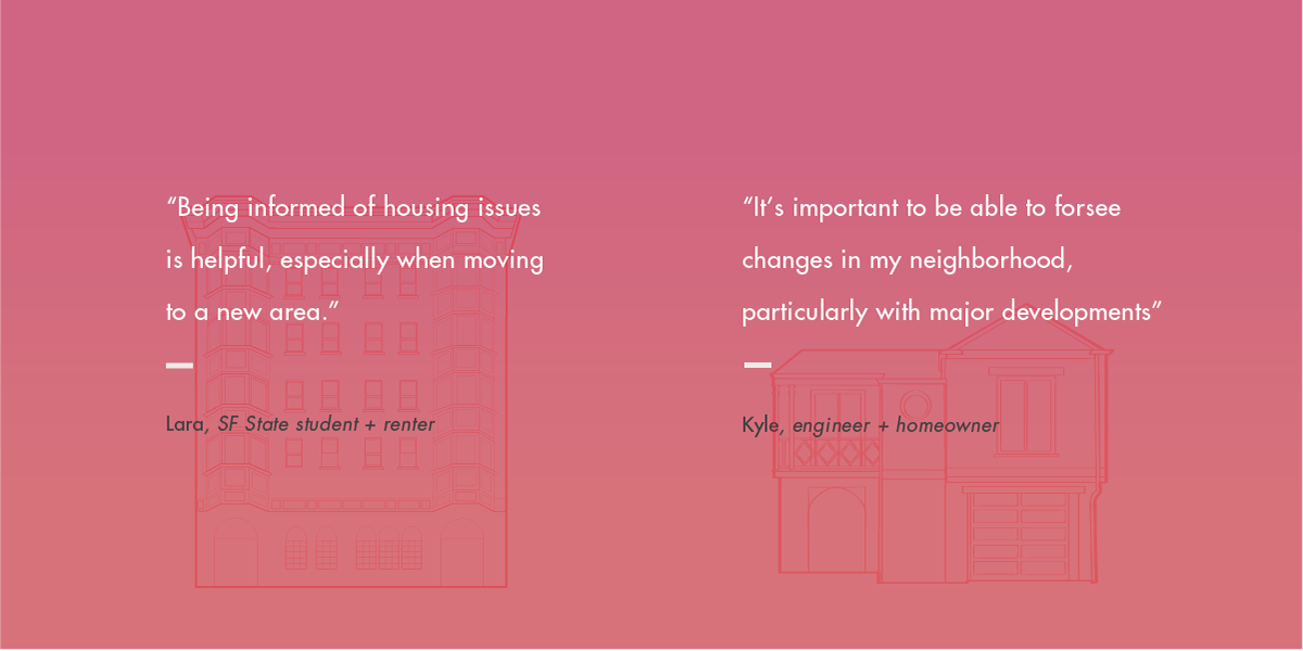
SF Renters and Homeowners Interviews
After identifying the needs of the Planning Department and city officials, I reached out to several San Francisco residents to discuss their concerns with accessing information about housing.
From recently relocated college students to long time residents, there were trends in their motivations and frustrations. It was a common interest amongst residents to know how their neighborhoods would potentially be developed in the future and what effects new housing policies would project. Residents were also curious to know about general renter sentiment in the city and exactly how high the rent burden is currently on income.
Addressing Transparency Needs
With consideration to the needs of a wide range of stakeholders, I worked iteratively with engineers on the team to explore possibilities of what the final parsed data would look like. Because the data set is so large, we had to streamline what initial data variables to display and which ones would be of most interest.
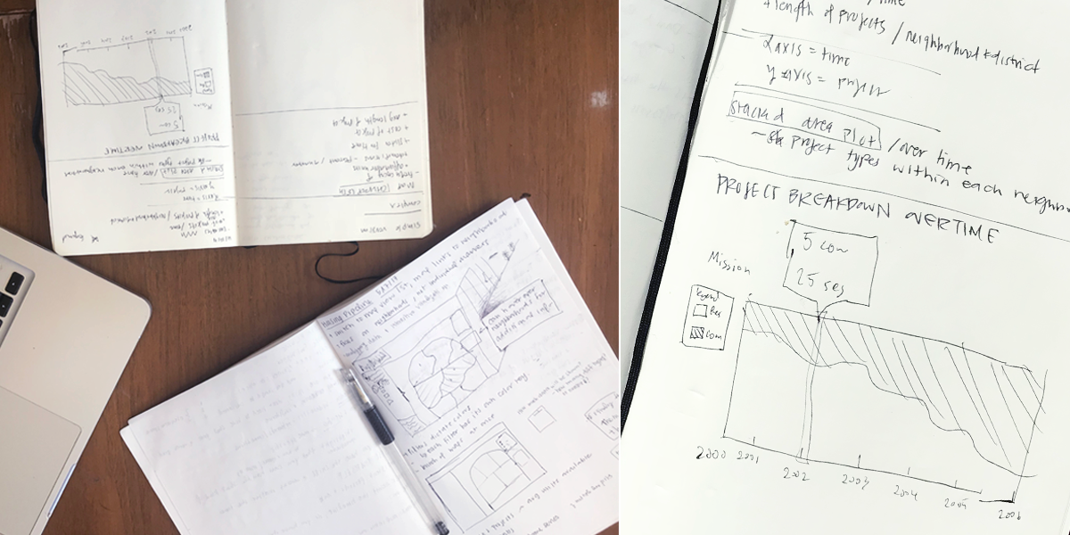
We decided our initial focus with parsing the data would be to determine and display the frequency of affordable units, demolitions, cost of project, and average length of project. We conducted several ideation sessions to sketch out and generate as many data and interface concepts as we could for our first visualization.
Challenges in Designing for Unparsed Data
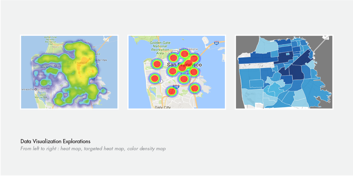
Visual Data Explorations + Engineering Capabilities
My biggest obstacle was finding a balance between the web interface and the data visualizations as they both informed each other.
I addressed this by initially assessing how the data might be visualized. This was a challenge since the data wasn't fully parsed yet. I also researched and referenced different data visualization possibilities. Specific attention was paid to the various programming languages that the engineers were considering utilizing, including D3.js. There were many factors I had to keep in mind with my design sketches, including backend development constraints.
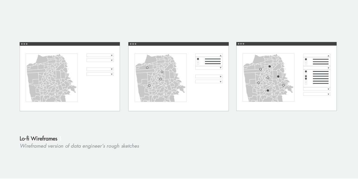
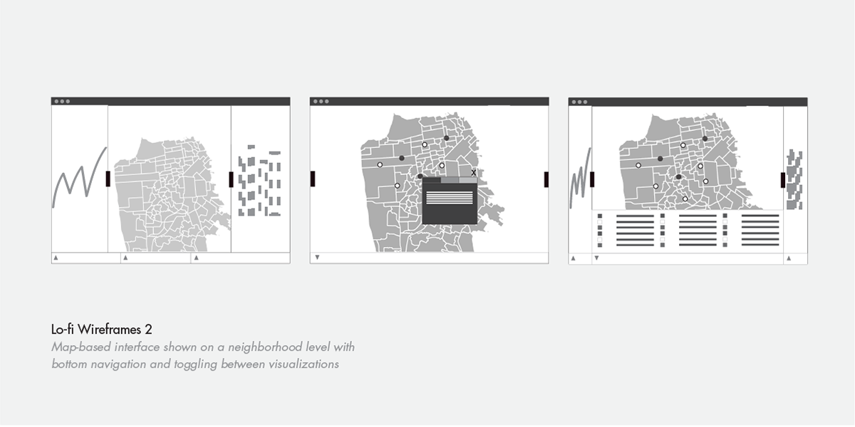
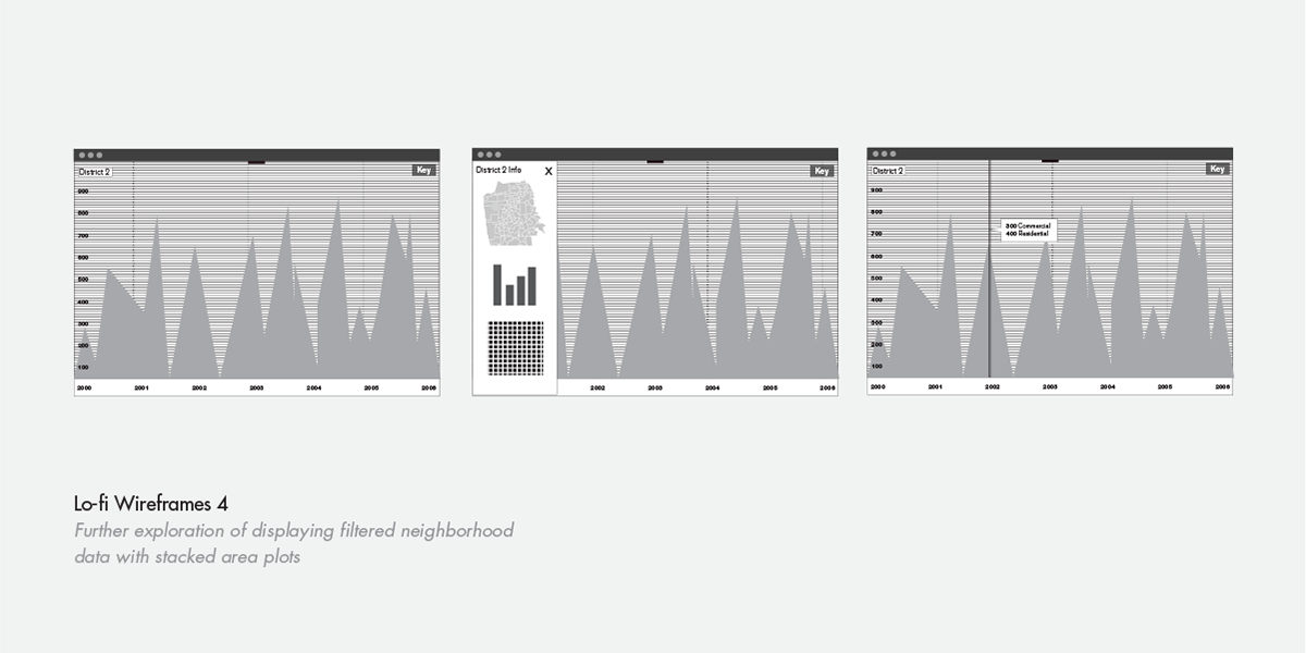
Low Fidelity Wireframes
From the rough data sketches I began to translate them into low fidelity wireframes.
Our initial priority was to display information on a neighborhood level and this was a big factor in how I organized the navigation in the interface. I wanted to balance both specialized functionality (for Planning Department members) and public accessibility (for interested residents).
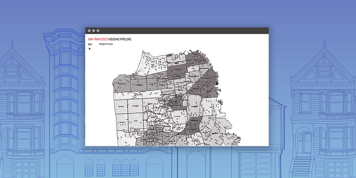
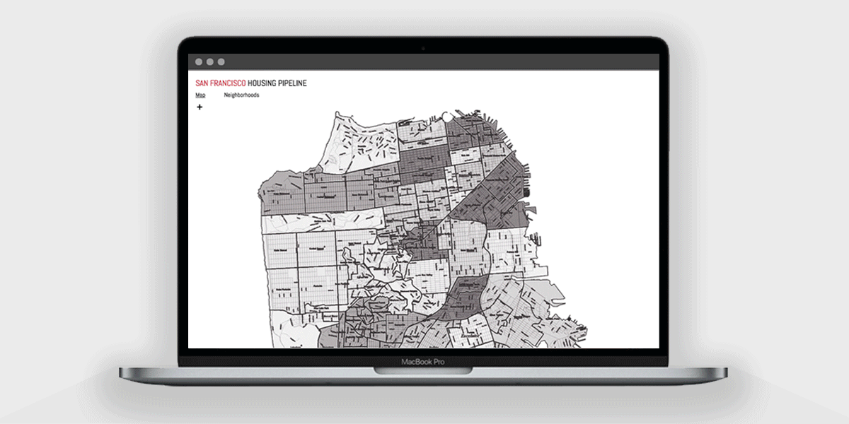
While we were interested in incorporating stacked area plots and other graphs, we decided to focus on a streamlined experience instead. Our implemented approach to actualizing the data was to create a simple but elegant map-based visualization that would clearly present individual variables.

Prototyping One of Many Possibilities
High Fidelity Prototype
After further discussions and interface explorations with the engineers, I decided to build upon wireframes that displayed housing data on a neighborhood level. We envisioned having a map of the city and displaying different variables based off of density by utilizing different colors.
Using Adobe XD, I prototyped and considered possible user interactions with filtering the following data variables: frequency of affordable units, demolitions, project cost, and average project length.
Project Status and Takeaways
Currently, the large data set is still being parsed and my designs and research documentation has been handed off to a new team that will continue with this project long term.
It has been a challenging and humbling experience working with other developers and project managers to envision the possibilities of refining a complex civic data set into a meaningful and accessible experience for all.
\

